Nothing Phone 3 was among the most anticipated releases for this year. Nothing, those trailblazers that build radically different phones with utterly cool features like the Glyph interface and user interfaces full of nifty widgets and design breakthroughs like see-through rear panels that make their phones stand apart from the pile of bland grey slabs of Chinese phones that all look like each other, were expected to deliver an absolute banger for their much-awaited new flagship. And a banger it is, but not for good reasons,unfortunately. The Nothing Phone 3 design is well, nothing as what was expected.
Please note that you might find this post generously full of nothing puns. You may apply them as intended or unintended as you may feel fit.
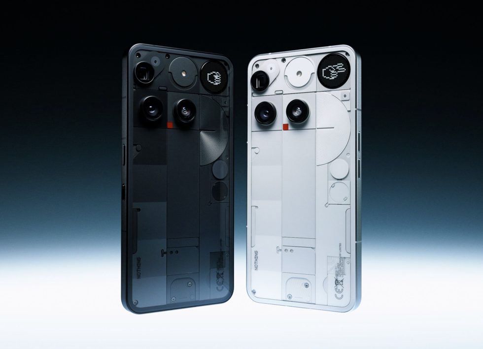
I mean, look at it. The Nothing Phone 3 design is terribly disappointing for being everything that everyone expected it not to be! A heavily crowded top 1/5th of the phone with an empty lower 4/5th. The top row has the Periscope camera lens placed heart-stoppingly on the edge of the phone, a huge semi-ish circle with the flash unit in it and then a sad circle what Nothing calls the Glyph Matrix that ostensibly replaces the iconic Glyph lights. And then on the next row come the two camera units and right in between them, the red LED square that lights up while taking a video. Half of the NFC coil then sits in the remaining part. Great care seems to have been taken to ensure complete asymmetry.
And the disappointment is unanimous across the board. Nothing that was expected from Nothing materialised here. The phone itself is big and unwieldy at 6.67 inches. I own a Nothing Phone 3A of the same size and it is way too big to handle comfortably. Most people were expecting a smaller phone.
They must really think that randomly placing camera and display elements on the back of the phone and then calling it “different” makes it appealing? But I think what the designers at Nothing really believe in is the magical power of asymmetry. Since symmetry is “normal”, they must think that asymmetry makes things radically edgy and above the plane that the rebels will rally behind. No, my dude, it just makes the phone UGLY! It it physically painful to even look at that phone, man. I absolutely can’t! My OCD makes it feel like a sharp steel blade is about to slice through my eye! My brain feels like it is glitching!
Symmetry is one of the things that “make” beauty, man. People are attracted to symmetrical things. No, it is not in the eyes of the beholder, it is human nature.
It is also why the Nothing 2A is still among the most beautiful phones I made. And the Nothing 3A is no slacker either. And then, the glaring asymmetry in the camera module was the most polarising aspect of the Nothing 3A Pro design too.
I think Carl Pei bought himself a bit too much into Nothing’s philosophy of it being edgy and different and cool as a means to an end. I think he genuinely believes that people would lap up anything as long as what he thinks is “different”. He probably didn’t realise that there are several types of “different” out there, and a “different” that does not provide aesthetics, usability and at least decent value for money means, well, nothing. It should be all that first and then, “different”. It is the same with all the so called-tech geniuses. They live in a bubble smelling their own perfume without any idea of the world about them. For instance, Elon Musk still seems to believe that he is the most loved man on the planet.
Case in point: He put out an entire post justifying their choice of the Snapdragon 8 gen 4 chip instead of the superior Elite version. And then he says things like “Not for everyone but for someone.” For Nothing to be successful, he needs to sell the phones. Selling nothing and then hanging on to cool, edgy statements will end him up with nothing. What tech companies need is proper product managers heading them who are not lost in delululand and and actually listen to users and consumers and build things that are actually useful and not what they think is useful. The Nothing Phone 3 design is the example that they don’t.
What made me buy a Nothing phone was its extremely usable design, the bloatware free UI and OS and the Glyph interface. Take the Glyph interface away and there is little that separates it from say Moto or One Plus or any other phone out there! It was literally the trademark, the personality, the brand identity of Nothing! In fact, among the technically less-inclined in India, Nothing is literally known as “the phone with the lights”. Now that the Glyphs are gone, it looks like Nothing’s brand identity has also gone away to nothing. The Glyph Matrix or whatever they call it, is a toy. It is a gimmick. It is utterly pointless for the purpose it is supposed to serve. It is easier to flip the phone around and look at the main screen than squint at a small dot-matrix circle.
Let us not even talk about the utterly ridiculous decision to price the phone like 25% above the competition of similar (and sometimes superior) spec phones. I mean, who is going to buy it at a massive Rs.80000 in India at these specifications? It is almost like they think that they have Apple-level fanbois who will pay a premium out of their pockets because it is Nothing?
My new Nothing 3A will probably last around 3 years. Unless Nothing course-corrects I will probably never buy another Nothing phone ever. And then, I will sorely miss the Glyphs. Nothing can replace them.
P.S. This makes it two disappointing design reveals in one same week. First it was KSRTC and now this Nothing Phone 3 design.